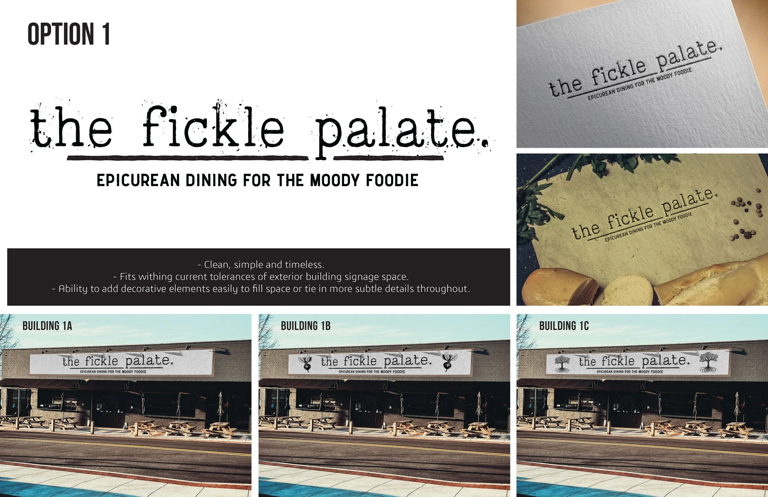
In 2023, The Fickle Palate opened its first Anderson, SC location as the “Epicurean for the Moody Foodie.” It is an eclectic tapas restaurant owned and operated by Chef Josh Crenshaw and Sommelier Shane Smith. The two creatives envisioned a contemporary space with a rustic, old-world feel to their new location.
The overall theme encompassed the timeless rustic feel with typewriter fonts and simple colors. These design elements provide a sense of nostalgia and authenticity. Typewriter fonts bring character and personality to any design. Their imperfect, uneven letterforms add a touch of vintage charm to the overall project. Paired with a modern sans-serif font, the two typefaces reflect the duality of the restaurant’s interior.
To complement the typewriter font, choosing simple colors was key. Muted tones and earthy hues, such as warm browns and deep grays, lend themselves well to a rustic aesthetic, creating a cozy and welcoming atmosphere.
The Fickle Palate
Restaurant Rebrand Exercise
Role
Logo / Brand Identity
year
2023
Tools used
Illustrator / Photoshop
initial iterations
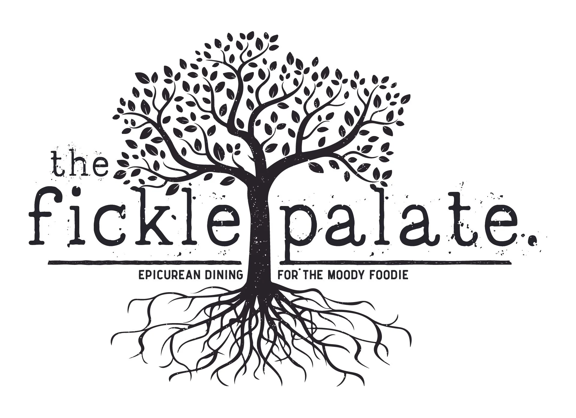
Since the parent company is Root & Vine LLC, the initial iteration included the tree of life.
Stacked variation of a clean, simplistic logo version with distressed typewriter fonts.

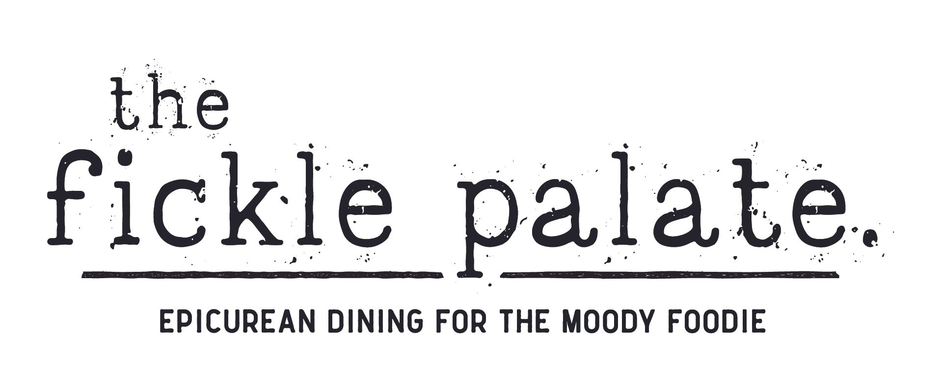
Horizontal variation of a clean, simplistic logo version with distressed typewriter fonts.

Incorporated sketchy elements of knife and root vegetable to provide flair with the ever changing ingredients used at this location.

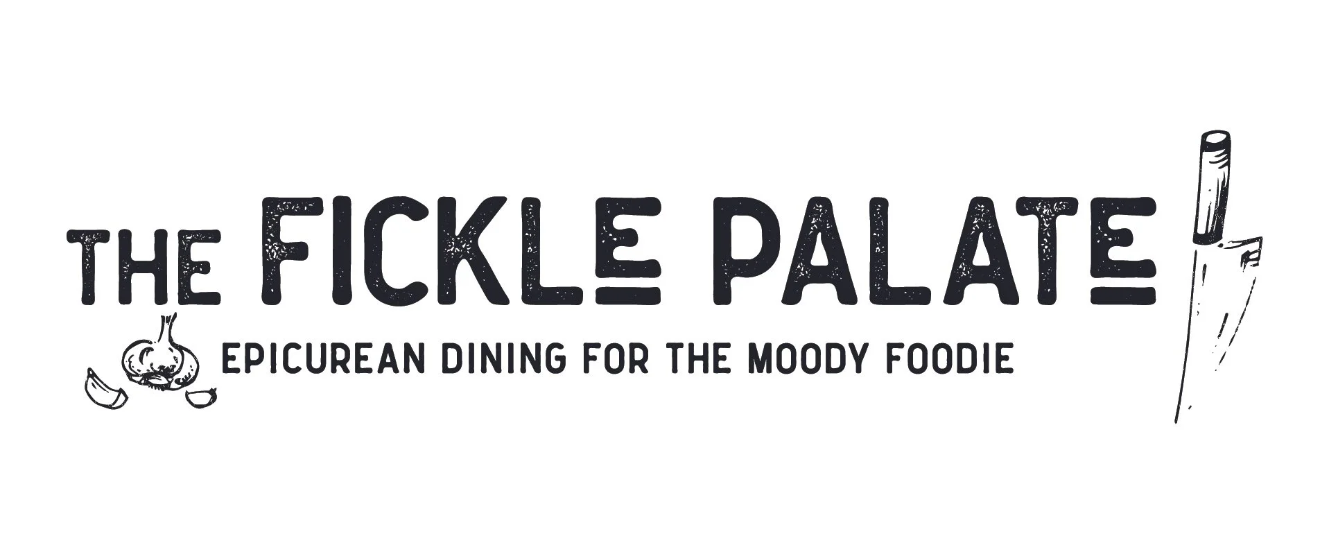
Instead of a Typewriter style font, this treatment included a more modern distressed styling.
Simplified variation of the secondary font choice with added sketched elements.